
Project overview
Problem: The user flows for account creation and sign-in on the Chico's e-commerce website presented unnecessary friction for users.
Solution: A redesigned flow provided an easier and faster path for users to sign in from the home page.
Role / Team: As product designer, I collaborated with a product manager and an engineer on this project.
Project duration: 3 months
Deliverables: User research, mockups, prototypes
The problem
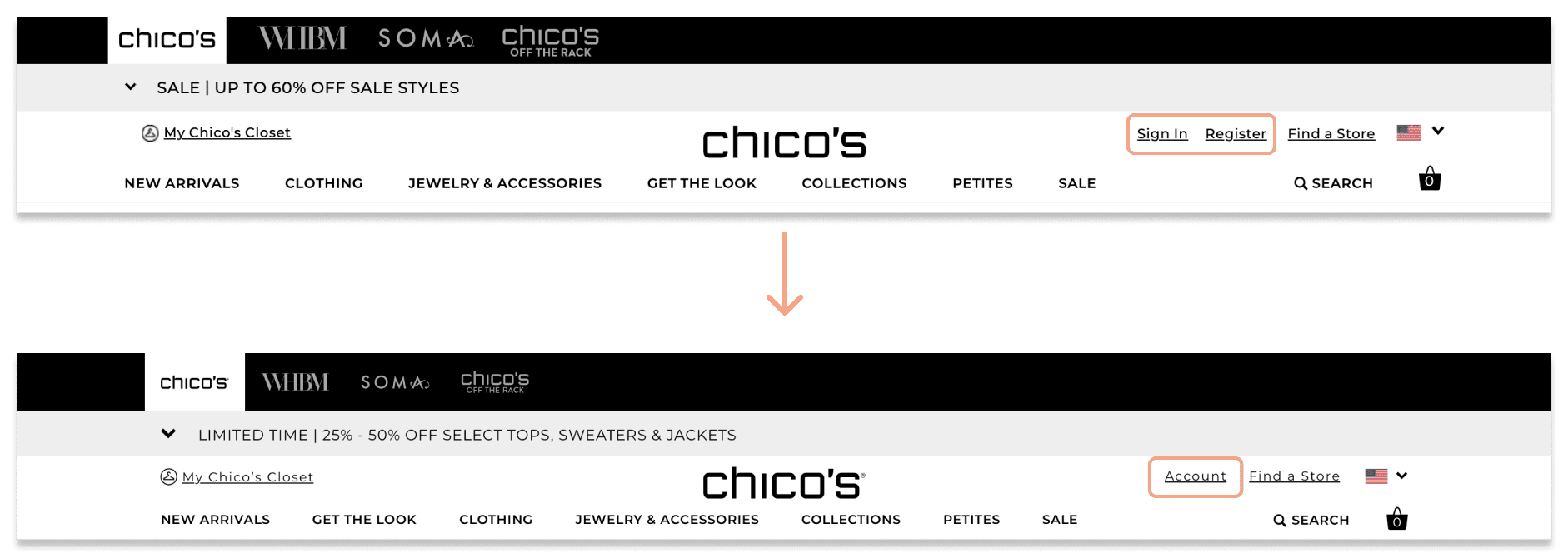
In the original header, user was presented with two redundant links leading to the same sign-in page.
Since both "Sign In" and "Register" links lead to the same page, they add unnecessary clutter to the navigation. Additionally, many users now expect an account dropdown menu to appear for sign in, rather than being redirected to a separate page that interrupts their shopping flow.

Like desktop, the mobile version presents users with two links that lead to the same sign in page.
The name of these links adds even more cognitive load to for the user: Am I already signed in? Do I need to sign in before selecting my account?
User research
Best practices indicated that users expect an account drop down to appear rather than being directed to a sign in page.
In reviewing design patterns from e-commerce leaders like Nike and Target, it was apparent that an account drop down was a more efficient approach than redirecting users to a sign-in page.
The Baymard Institute, a UX research leader in the e-commerce space confirmed this. They described having a dedicated sign in page as "a needless detour, adding unnecessary navigational friction, and introducing ambiguity regarding where a user will be sent after signing in.”
Design iterations
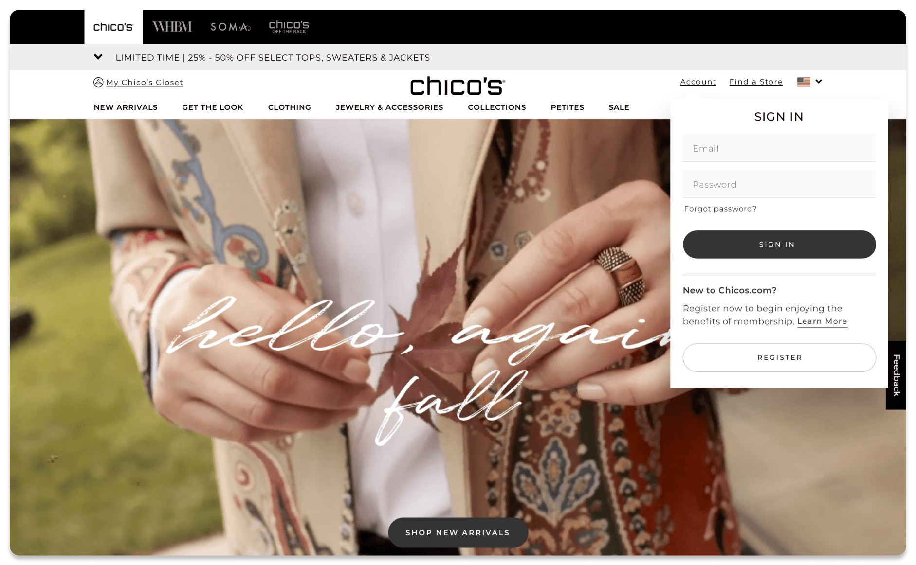
I first updated the global navigation by combining the redundant “Sign In” and “Register” links into one “Account” link, as shown below.
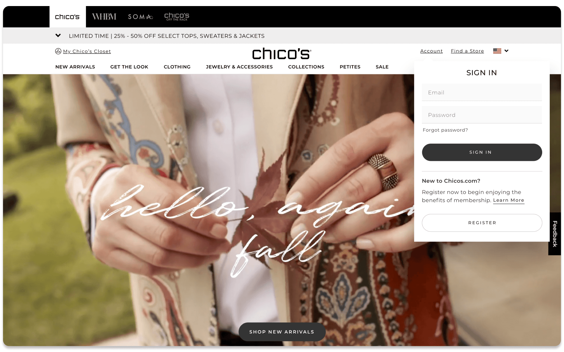
I then used design system components to create three iterations of a new sign-in drop down.
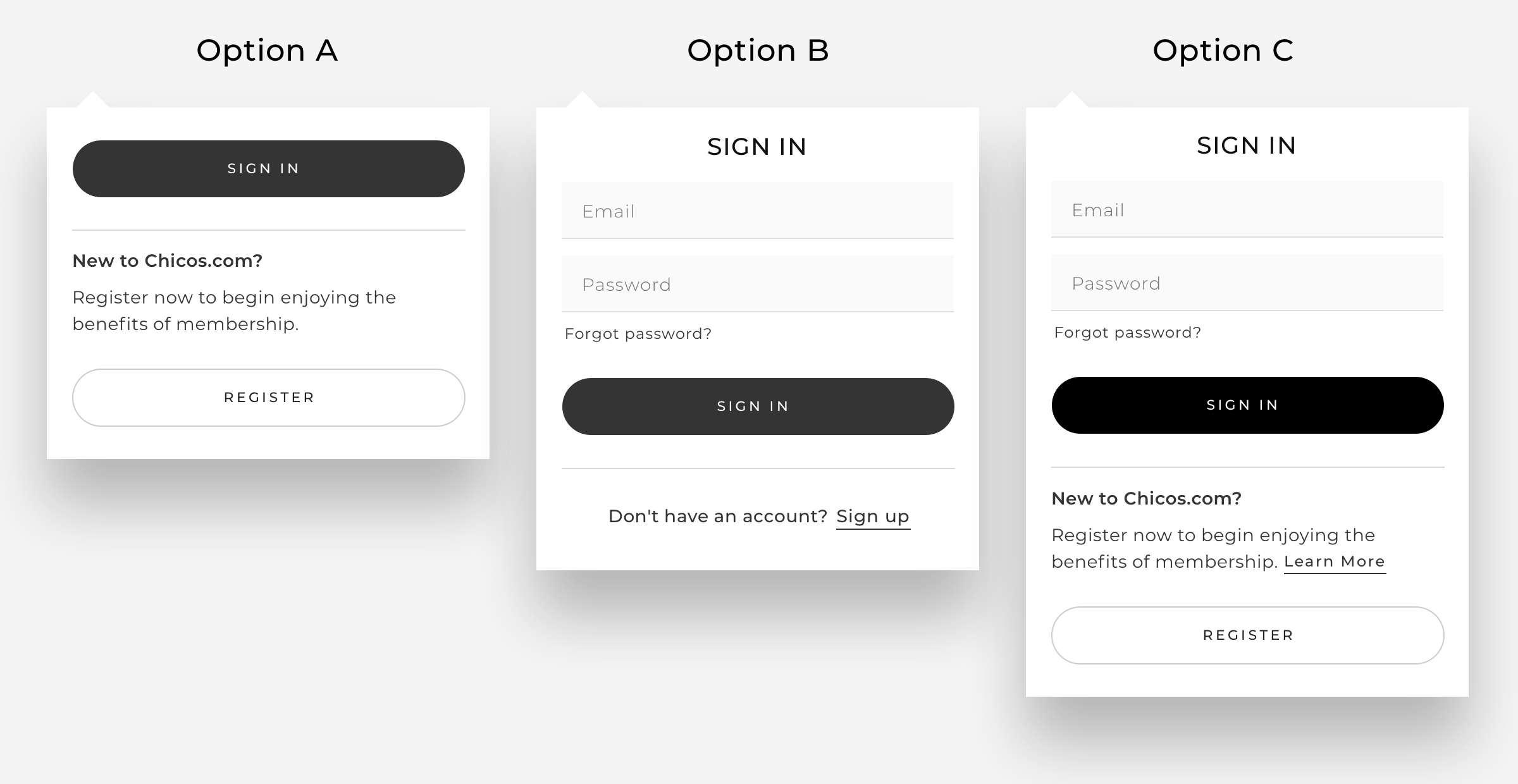
Option C contained all the elements of the existing sign-in page without overwhelming the user. It was also important to include a value proposition for the user on the benefits of signing up as a member, to encourage users to sign up if they didn't already have an account.
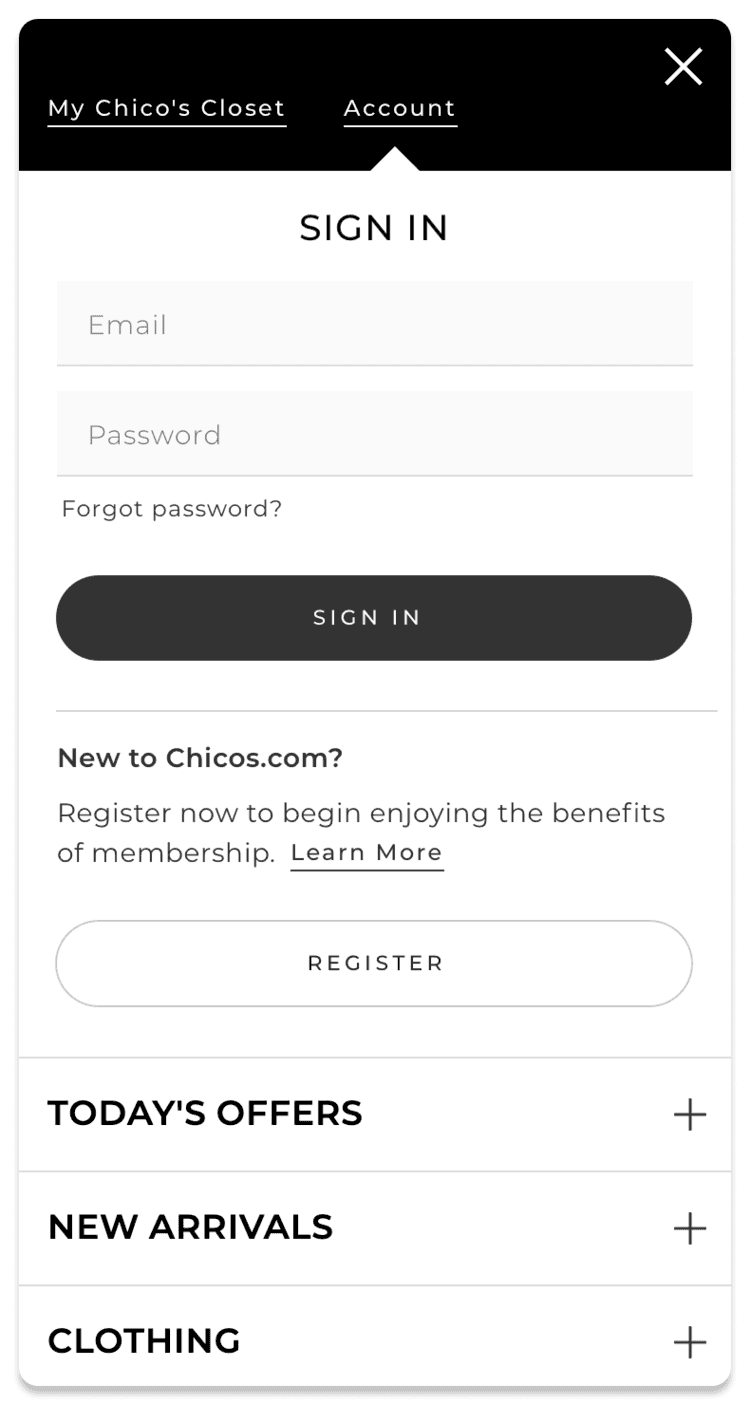
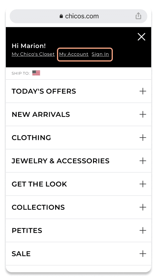
The account drop down adapted to mobile with minimal adjustments. When the user taps the account link, the account drop down appears at the top of the menu. The rest of the menu remains visible and scrollable below.
Prototypes
Next I created prototypes to work through how the account drop down would respond to user interaction.
On desktop, the drop down would appear on hover to remain consistent with other elements of the global navigation, which also activate on hover.
On mobile, the user navigates to the hamburger menu and can then select the account link to access the drop down.
Reflections
This project was a fun opportunity to explore a common user flow and offered a quick win for reducing friction on the Chico’s website. I’m excited for the possibility of this leading to further improvements - for example, creating an account drop down menu that replaces the user account page as well. This way users can access account self-service actions from the global header on any page in the site.
By implementing this design, we have created a more efficient sign-in flow for thousands of Chico's users. I’m looking forward to seeing this design in action once it is built in our upcoming sprint!