Building & leading a design system for a SAAS startup
Project overview
Problem: Our design and development teams worked inefficiently by creating components from scratch with each new project.
Solution: A design system sped up our product development process and allowed for more cohesive product vision.
Role / Team: I led the creation of the design system with feedback from the design team. I also supported development teams in creating a code library based on the design system.
Project duration: 3 months to launch MVP; followed by 9 months of iteration and adding features/components.
Deliverables: Design system with over 400 responsive components used daily by design and development teams.
Research
I looked to the design community for guidance and inspiration on building a powerful yet flexible system.
I found that Google and Shopify's systems were good examples that aligned closely to our needs. I also used Figma as a resource for learning about shared libraries and responsive components.
It was important to build a system that contained our most commonly used components and answered frequently asked questions. However, I realized that adding too much complexity could make things harder to find and maintain at the end of the day. I worked to find a balance of meeting our needs while not adding unnecessary processes to our work.
Organization
Next I established a framework to make the system easy to navigate and build upon. The structure I created was based on a combination of patterns from other design systems as well as Figma community files that contained useful pre-made building blocks.
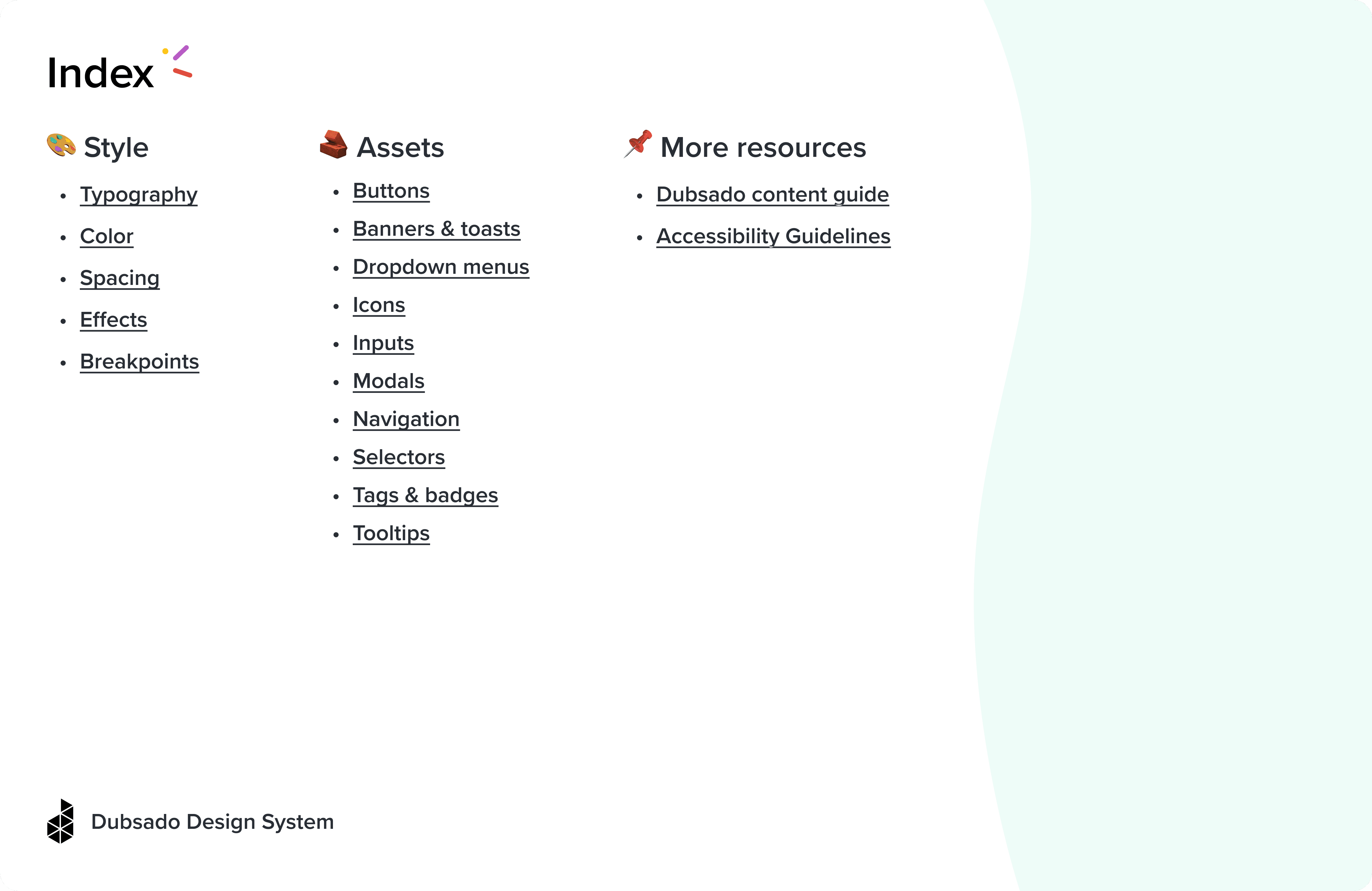
On the first page of the file, I set up an index with links for easy navigation.
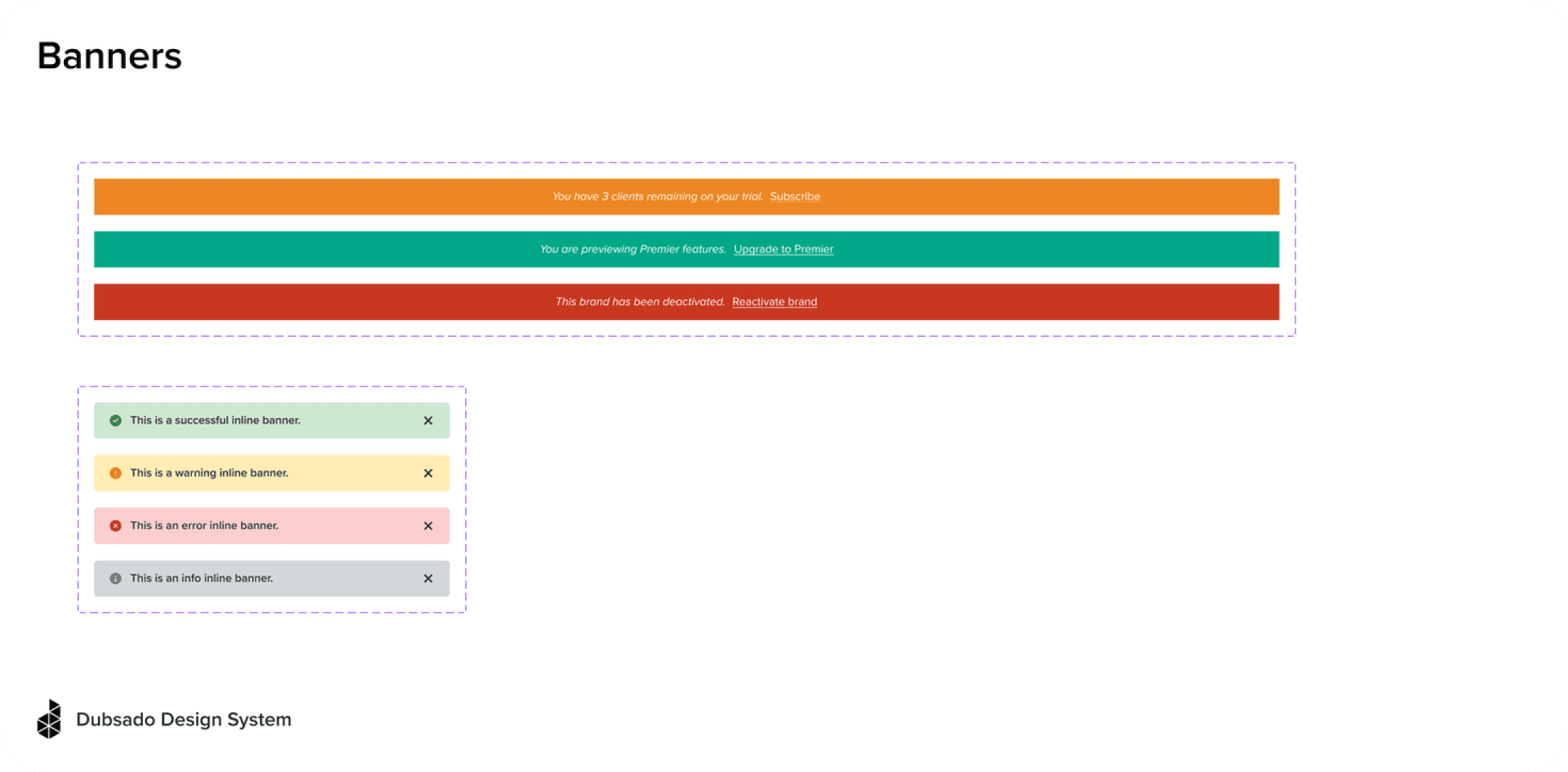
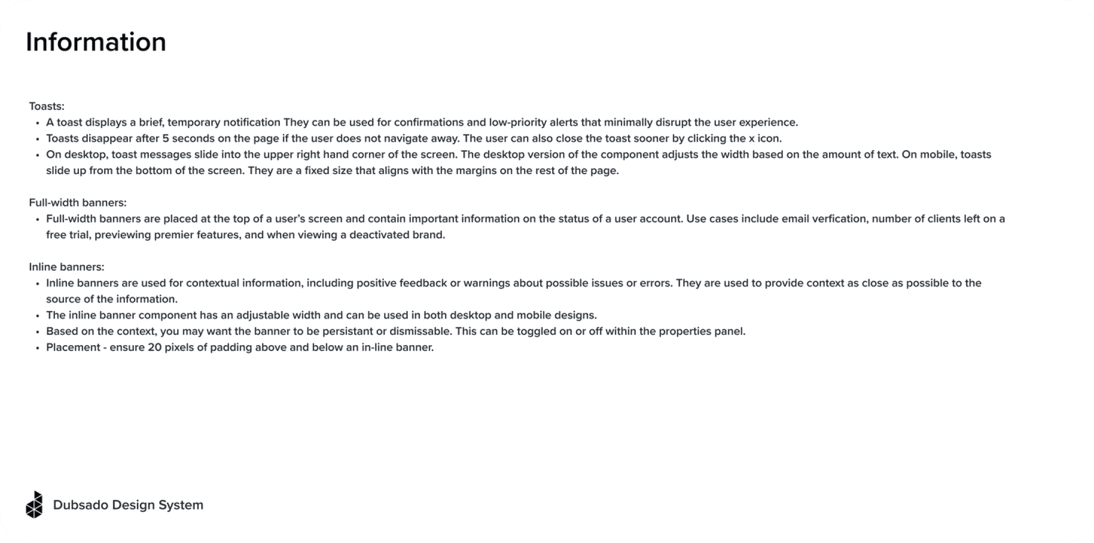
Then I created component pages that used a consistent template to organize assets and documentation. I archived unnecessary clutter from the original file, and laid out key information in a clear and accessible way.
This simple step dramatically changed our day-to-day as we could quickly locate components while designing, and link to them if a developer reached out with questions.
Components
With a structure in place, I added more dimensionality to components to meet the needs of our design work. To do this, I used the following tools in Figma:
Auto layout: allows components to grown or shrink based on the content inside, while maintaining alignment and spacing
Variants: accounts for the variable states of components, including default, hover, focus, and disabled
Properties: streamlines components by defining aspects that can be changed and customized
For example, I used properties to account for button size, state, label, and left or right icons as shown here:
Testing
As components were added to a shared library, I asked the design team to try them out in their work. Did the components behave as expected? Could they be adjusted and customized based on context? Were all states and interactions accounted for?
The team gave vital feedback on how each component could be improved. We learned as a team about the possibilities of components, and gained confidence in using new components right away, while iterating over time.
Partnering with engineering
I reached out to the development org to share our new system and solicit feedback.
To bring the development team on board, I met with senior members of the team, and also shared the following resources with the entire development org:
Shared a screen-recorded video tour of the design system for developers
Put together a design system resource document in Notion
Gave a design system presentation sharing our recent progress, highlighting the benefits of reusable components, and welcoming open communication and feedback
As a result, Dubsado’s development teams started a library of React components in Storybook to mirror design system components, leading to more efficient work on the engineering side as well.
Iteration & documentation
In response to feedback from design and eng, I added additional layers of documentation for a more detailed look into each component.
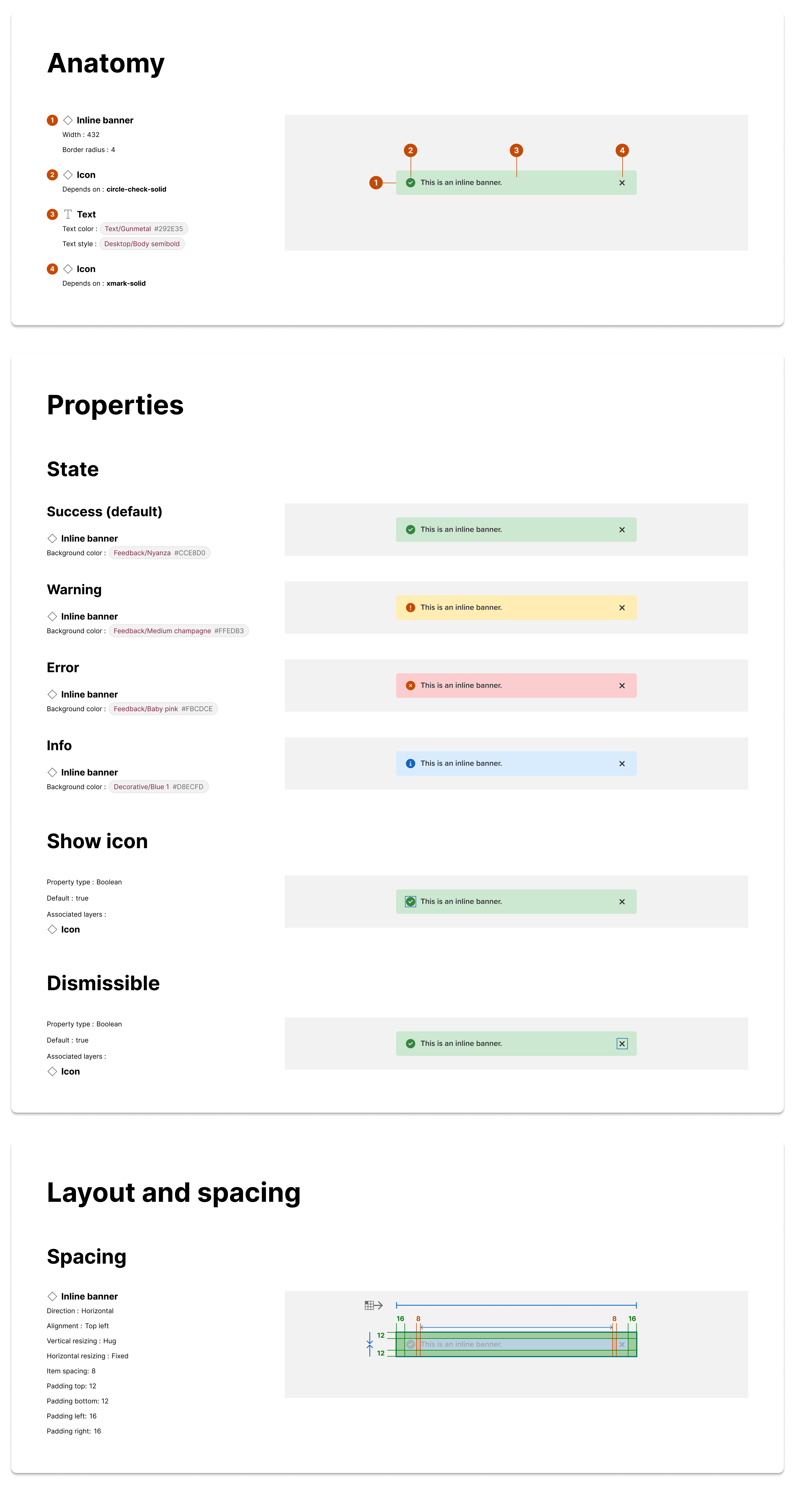
I used a Figma plugin that generated frames detailing the anatomy, properties, and layout of each component. Adding this information to each component made it easy for designers and developers to see the construction and functionality of each component at a glance.
Reflections
This project was rewarding because it led to increased productivity and collaboration in our product org, making our work more efficient and fun.
I learned that I enjoy thinking about the big picture and building cohesive systems that serve users. In this case, my immediate users were the internal design and development teams at Dubsado.
By extension, I saw that the design system allowed us to improve our end user experience as well. By investing in our design system, we were equipped to ship faster and better product.
