Pointer
Iterating on a mobile app for students applying to college
Project overview
Problem: Pointer, an app matching high school students to prospective colleges, was experiencing a decrease in user engagement metrics after onboarding.
Solution: A navigation menu and improved task list feature increased the stickiness of the app.
Role / team: I worked as a freelance product designer with the startup founder and engineering team.
Project duration: 3 months
Deliverables: Site map, pattern research, concept sketches, mockups, prototype
Navigation & Hierarchy
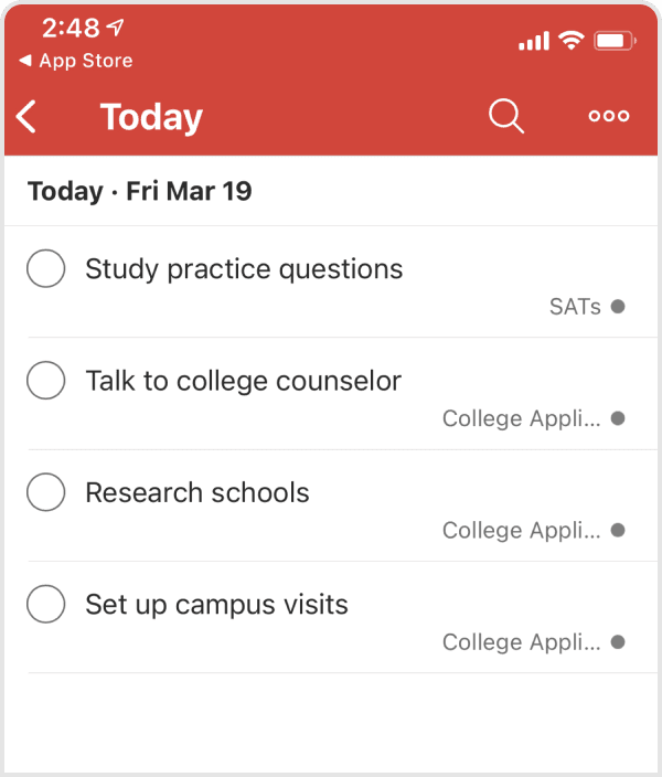
The app navigation made it difficult for users to understand the features and offerings of the app.
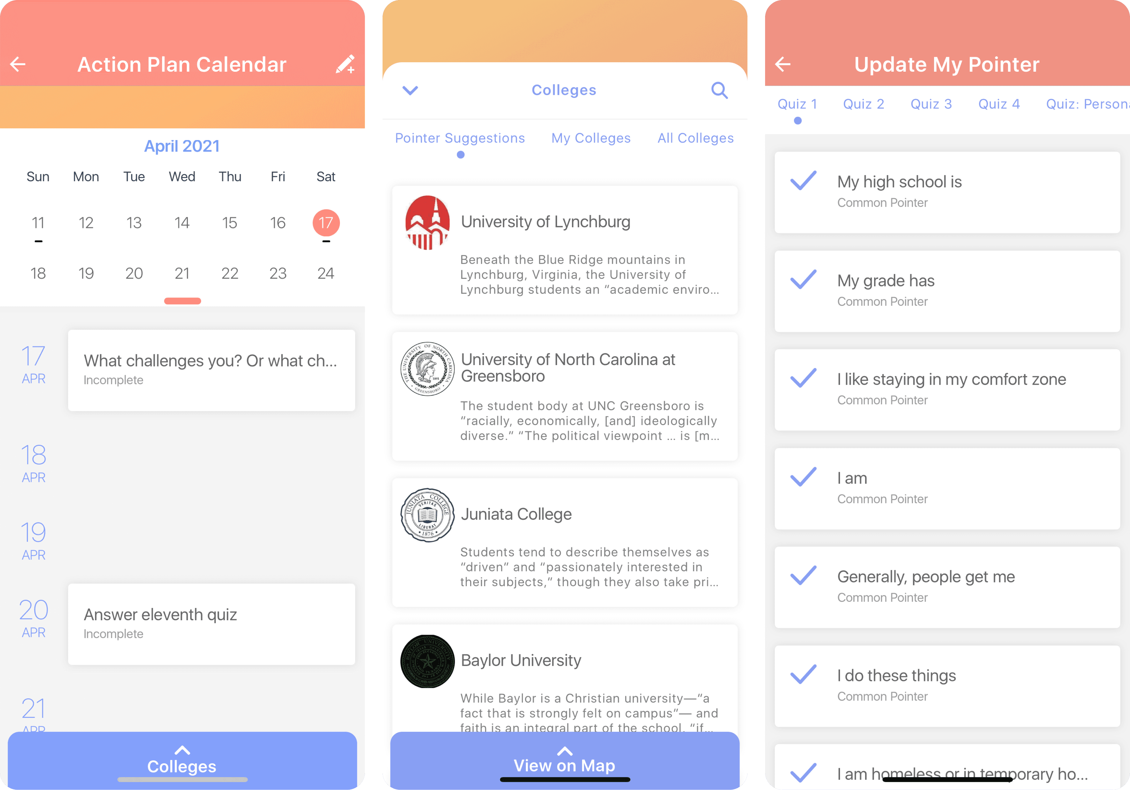
As shown in the original screens below, the app used back buttons and bottom sheets to get from one screen to the next which made navigation confusing for users.
When I created a map of the site, I saw that the app was set up with an inefficient navigational structure.
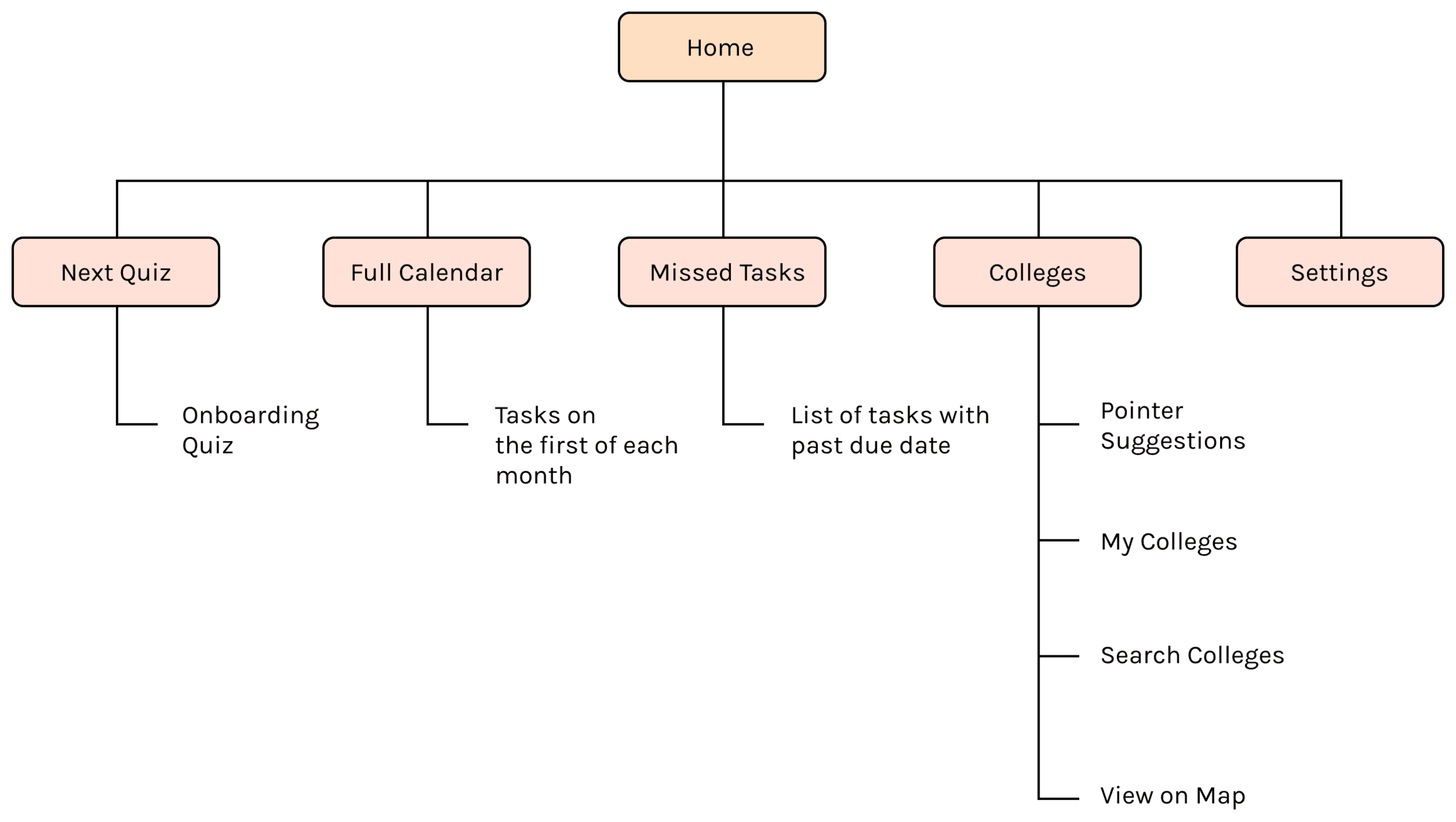
In order to go to another destination with the app, the users had to retrace their steps back to the home page each time.
The app structure could be simplified by flattening it out, so that users could easily switch between content categories.
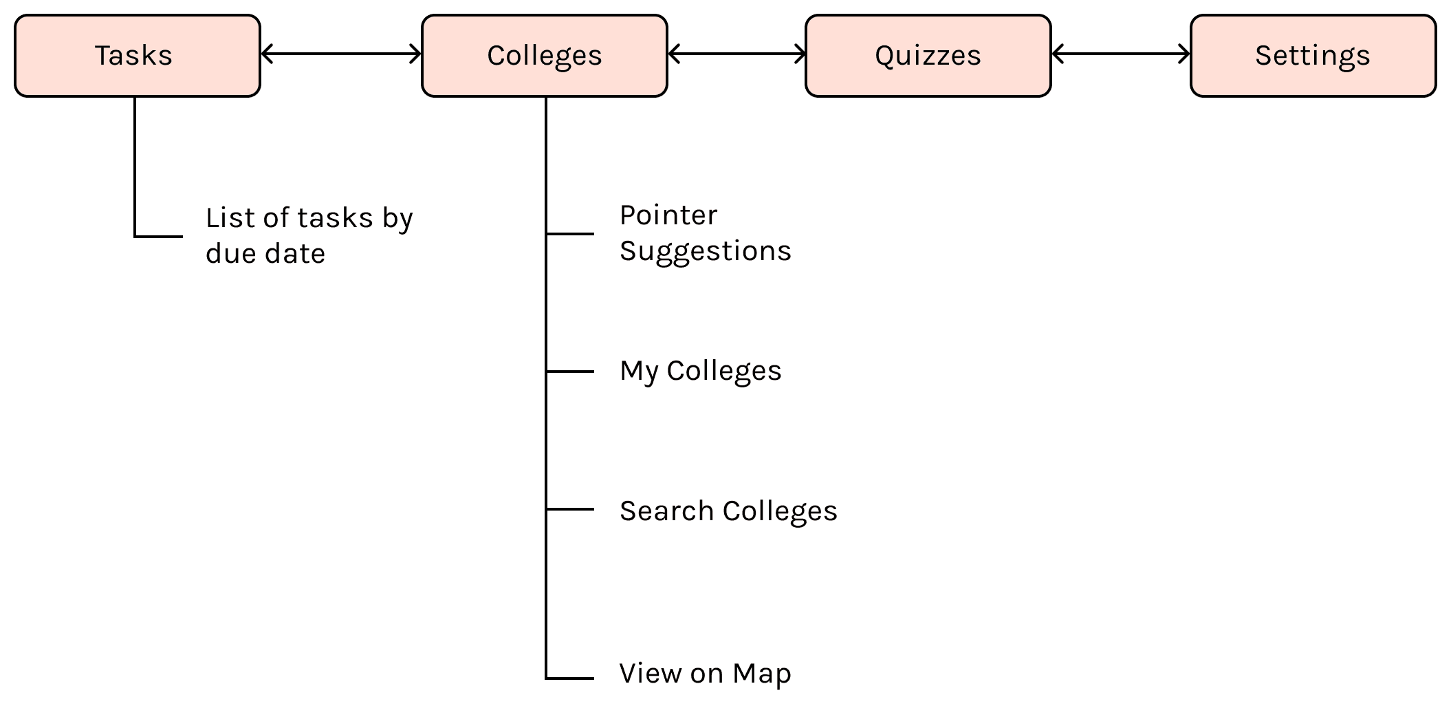
By mapping the site, I identified four peer categories: Tasks, Colleges, Quizzes, and Settings.
Pattern Research
A tab bar would eliminate the home page menu, and allow users to navigate freely from anywhere in the app.
I referred to Apple’s Human Interface Guidelines for insight into navigation patterns. A tab bar was a great solution for flattening the hierarchy of information and providing access to the four content categories from anywhere within the app.
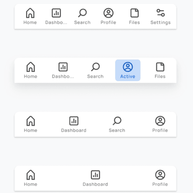
With the tab bar serving as navigation, the home screen could be replaced with the most frequently visited page in the app - the task list.
Once a student has been matched with recommended colleges during user onboarding, they would return to the app’s task list to help them work through the college application process.
I saw a number of usability issues with the current task list, so I looked at two popular task management apps, Asana and ToDoist for redesign ideas. Both provide systems for organizing tasks by deadline and project, while keeping the layout minimal.
Concept Sketches
I sketched several iterations of the tab bar and the task list to quickly convey my ideas to the Pointer team.
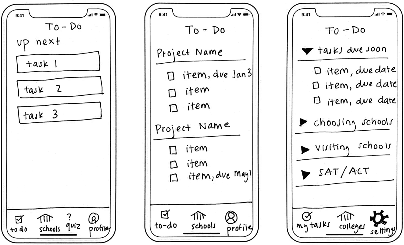
The team immediately appreciated the clear navigation provided by the tab bar. They also agreed with my recommendation to organize tasks as a check list rather than as stacked cards for an improved user experience.
Mockups
Tab Bar Navigation
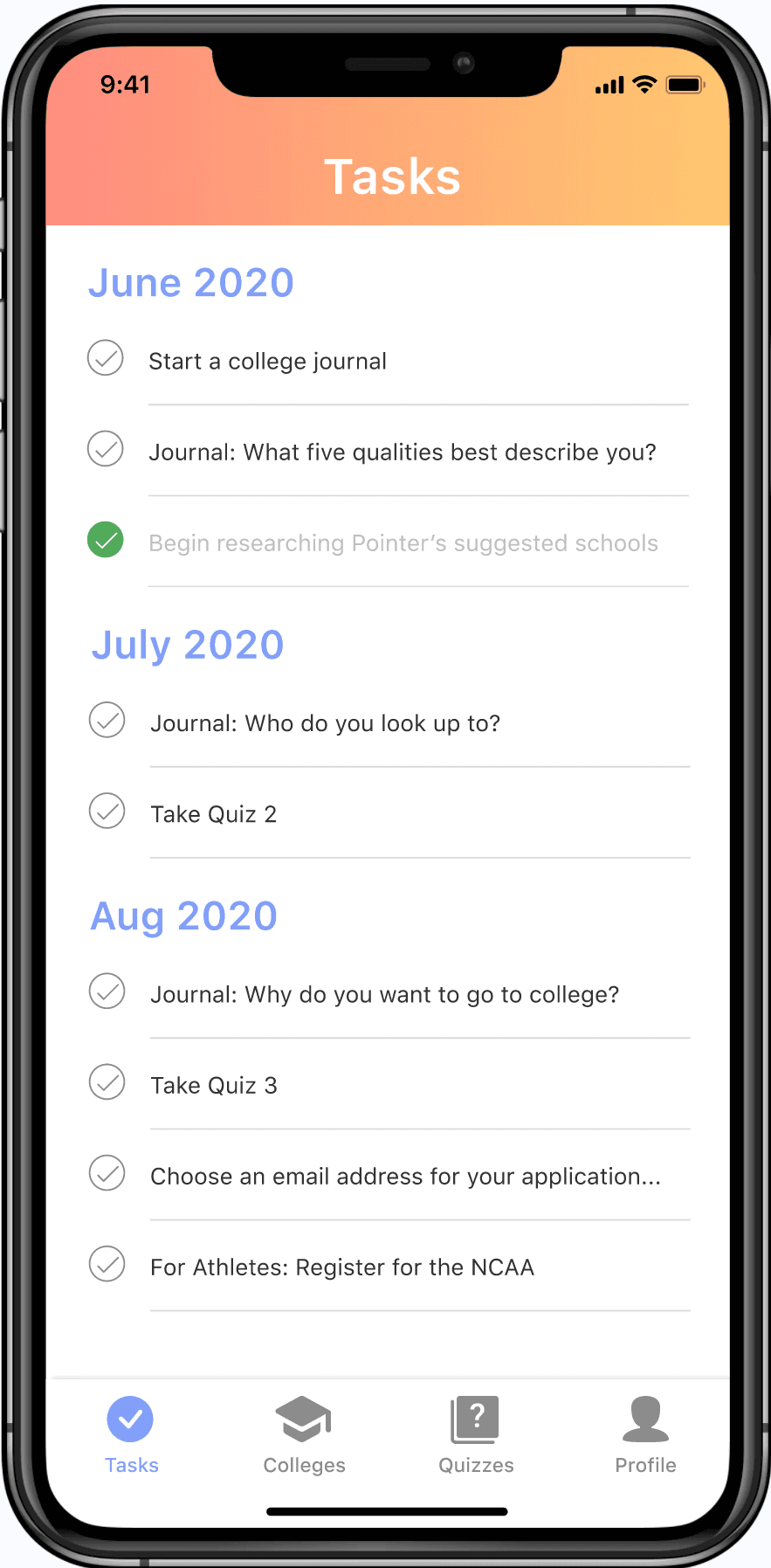
To update the design, I added a tab bar navigation to the bottom of the screen. I also added a consistent header so that users would feel more grounded in the app.
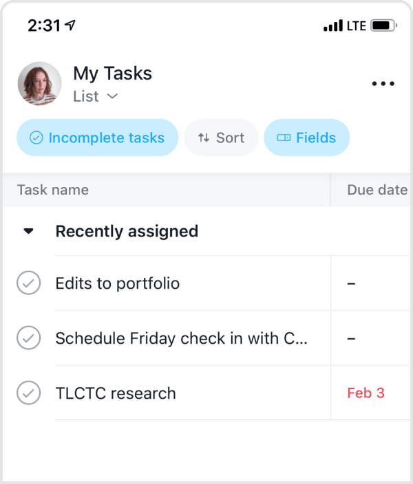
I made changes to the tasks page by removing the bulky calendar and stacking the task cards by due date so they are more easily viewable.
Improved Task List UI
The task list now displays items in a list that can be marked off to give users a sense of accomplishment.
Users can click into each task to view additional details and also mark it complete from within this view.
Reflections
This project was a great exercise in taking an existing design, analyzing what works and what doesn’t, and making intentional changes to improve the overall experience for the user. Many factors of this project had to remain static, for example the app content itself was off limits, so my task was focused on reorganizing that content to make it more easily consumable for the user.
As of August 2021, the designs have been built and shipped in a Pointer app update. I hope there are some high school students out there who are feeling a little more confident in their college application process as a result.